Update

An Update

I’ve not posted here in quite some time. Although I’ve tried to keep up with some of my fellow blogger’s posts I haven’t been able to blog on either of my sites with any regularity. Because of that I’ve made the decision to cut back to only one blog http://www.odds8ends.wordpress.com . I’ve enjoyed The Milos-Ivanski Studio blog and the people I’ve met online through it but http://www.odds8ends.wordpress.com is my original blog. It was established in 2005. Originally supported on MSN Spaces blogging platform, the site has been migrated twice; first to Windows Live Spaces and now to the current platform at WordPress. Over the next little while I’ll be transferring some (not all) of the content from this blog to there. If you’ve linked to anything here that link will be broken when I delete this blog. I’m currently using the free version of WordPress and I won’t be able to do a redirect for any of the posts. I do apologize for any inconvenience that might cause.

Wishing you all the best,

Lori

Update

Painted Phone Case

I thought my phone case could use a little dressing up so I added a belted kingfisher. It looks a little odd when opened up and laid flat. Closed it works as 2 images with the bird on the front and its habitat on the back. The case has a sealed finish so it doesn’t lend itself to this kind of process. I did add a layer of varnish but the act of opening and closing the phone case regularly means this decorative detail won’t last very long. I have a tendency to paint random objects on a whim.  Permanency isn’t factored in as it’s just for fun.


Sketchbook Selection – Crow Study

This crow study was completed in my small (5 1/2 by 8 in) sketchbook. Rather than using a pigment (ink) pen this image was rendered with a brush, Speedball Super Pigmented Acrylic Ink, and acrylic paint. Using a brush with the acrylic ink allows for the opportunity to make a variety of marks without changing tools. The super black ink is highly opaque when undiluted but I also used it as a wash here to create different tones. I opted to work from dark to light and layered acrylic paint on top of the ink to flesh out the image.

October 2013 – Killarney Trees

I shared this drawing online here in October of 2013. For some reason that post attracted weekly multiple spam comments even though I edited it to indicate that comments were being moderated before being made public. As a final resort I’ve deleted the original post. I still want to share the drawing so I decided to re-post it. Hopefully the same issue doesn’t arise.

Killarney Provincial Park is located on Georgian Bay in my home province of Ontario. My favourite time of year to camp there is in the fall. There are less people around at the end of the season and the fall colours are gorgeous. I do draw and paint a bit on site but not too much. I like to be present and enjoy the park so I try to take a fair amount of photos to work from later. This piece was completed from a picture I took on the Lake of the Woods Trail. The drawing was made using pigment ink liners on a heavy cold press water colour paper. The pigment ink and texture of the paper create an effect that’s reminiscent of an etched print.


Painting on Found Objects – Barn Owl Saw

It’s common to find old implements at yard sales and second hand stores in my area. They can be oil covered or rusty so prep work is required before they can be painted. I bought this saw from a second hand charity shop. It was rusty so I sanded it and applied a coat of Tremclad rust primer to create a sealed base coat. The barn owl is painted in acrylic. It’s a bit stylized which I think is a good approach for a found object painting. To finish I applied a spray coat of Krylon varnish to the blade to protect the painting from scratches. I left the handle alone as I like the worn condition left from actual use. It’s a bit of an odd object to photograph so I opted to hang it on plant hook in my back yard to get a full length picture. I’ve included a closer look below as well with a bit less of the background.


As The Crow Flies

This 12 inch square piece is acrylic on board. I combined imagery sourced from my collection of photographs to create the narrative.

This is the first time I’ve attempted something figurative on such a small scale. I’m not sure if it’s something I will repeat. Because the picture above is a close up cropped image you can get a good sense of the elements but viewing the piece from a distance (as in the un-cropped photo below) I feel like a bit of that is lost because of the size.

That said I don’t feel the piece is unsuccessful. I did establish a solid narrative theme, which was my original intent, as well as learned a bit about the ins and outs of working smaller.

Sketchbook Selection – Owl in Flight

This image was rendered with the #2 Pigma archival ink brush pen and Staedtler pigment 0.1 and 0.05 liners. The drawing is 5.5 inches by 8 inches. This is the second of three owl pieces I completed. If you’re an owl expert (not saying there’s any around these parts but they’re out there somewhere) you may have noticed that this isn’t exactly a faithful rendering. I was interested in attempting to convey something more immediate (or even whimsical) that I associate with those momentary glimpses we so very rarely catch of owls or larger birds in general.


Painting on Found Objects – Juvenile Great Grey Owl

My house was built circa 1910. Being a lath and plaster construct, it wasn’t insulated. The people who owned it before us installed blown insulation in the walls and attic. At that time most of the attic flooring was removed leaving a few planks to walk on and a couple of smaller cuts lying around. I’m not sure what kind of wood the flooring is but I’m of the mind that it might be hemlock. The portion I used to create this piece has a lovely rich colour along with some interesting dings and scratches. Neither the bottom or top are cut even. It’s an odd fifteen-ish inches high and a smidgen under one inch deep. It is tongue and groove but the groove side was snapped off (it’s still a foot across though). It’s not “pretty” but those are my favourite kind of found objects to use. They have their own history and that added element enriches the final piece.

I’ve not been lucky enough to photograph a Great Grey Owl so I went online to research my subject. I didn’t draw from any single source but rather found inspiration in a variety of places. I noticed that owls exhibit consistent perching behaviour no matter the breed or environment so that determined the composition. I used a layer of matte varnish to seal the wood before I started painting. This juvenile Great Great Owl, painted with acrylic and somewhat stylized, is all about the brushwork. Building from dark to light I fashioned shape and substance with layers of small brushstrokes making no attempt to blend or smooth them out. I wanted the image to retain the unique properties of the wood surface. To that end, although there are multiple layers of paint it’s not so thick as to hide the texture of the wood allowing it to be seen through the brushstrokes.


Hide and Shriek Production Work

I’ve been busy working with my local theatre as they staged their spring production of Hide and Shriek by Tim Kelly. I had a bit of a hand in everything this time around. I was involved with general administrative production work, set decoration, arranging advertising, running social media outreach, and acting.

Administrative production work is a catchall for general things that need to be done (printing tickets, compiling program information, inquiries and bookings etc). The social media side is a bit more creative. I had the opportunity to go full on cheesy with the campaign publishing fun little posts like the one below.

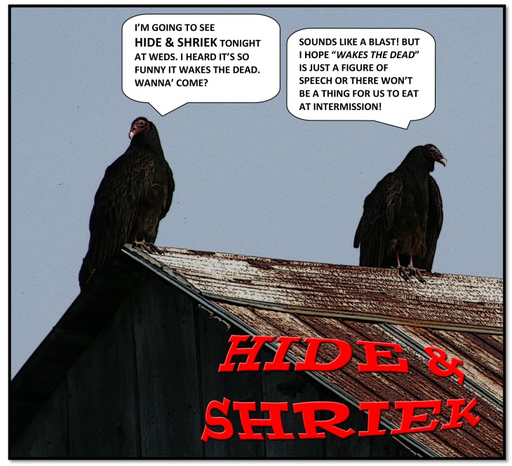
I edited this original photograph with the poster edge filter, added some corny text, and ended up with a quirky promotion piece. I did some gif posts as well to change it up.

The set had a standard footprint. Door and window locations were determined by plot line and blocking. The space was to be reminiscent of a once stately home that had fallen into disrepair through neglect.

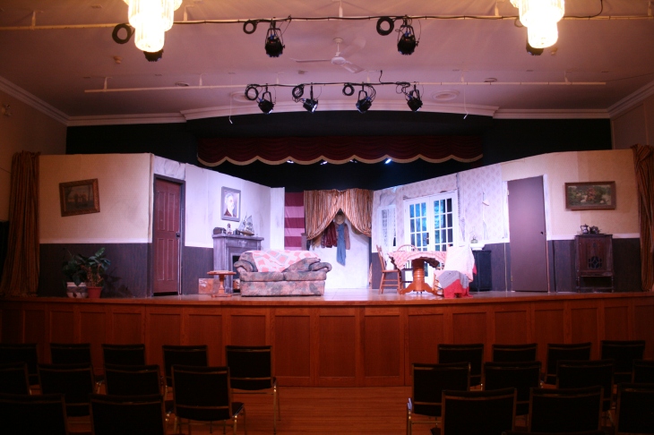
The set took me about 20 hours to decorate.

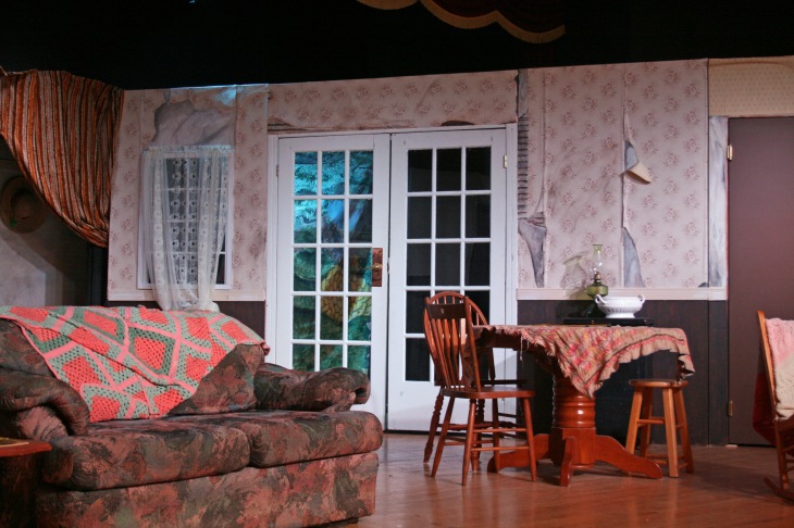
If you’ve seen any of my prior theatre posts you may remember the back drop behind the french doors from other productions. It’s painted on a bed sheet I picked up at a thrift store for $3. I’ve used it in 4 plays so I think I got my money’s worth.

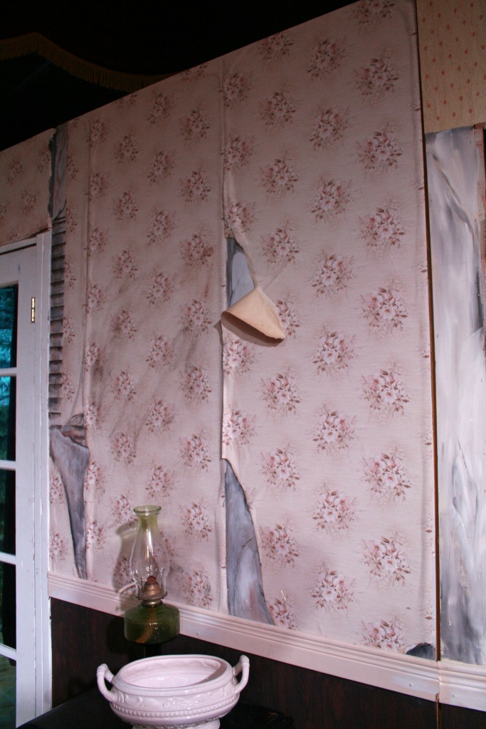
A selection of old mismatched wallpaper was the perfect material to use for the “walls” working to express traditional and multilayered decorative sensibilities. Backed with age weakened paste, the paper sagged in a way that spoke to the neglect narrative. I have a handy dandy tool that generated the appearance of wood grain on the bottom of the flats.

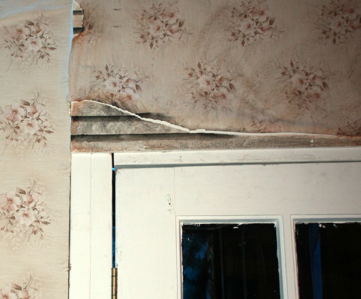
I used faux finishes to create the look of bare plaster and lathe revealed through breaks in the wallpaper further emphasizing the “age” of the stage setting.

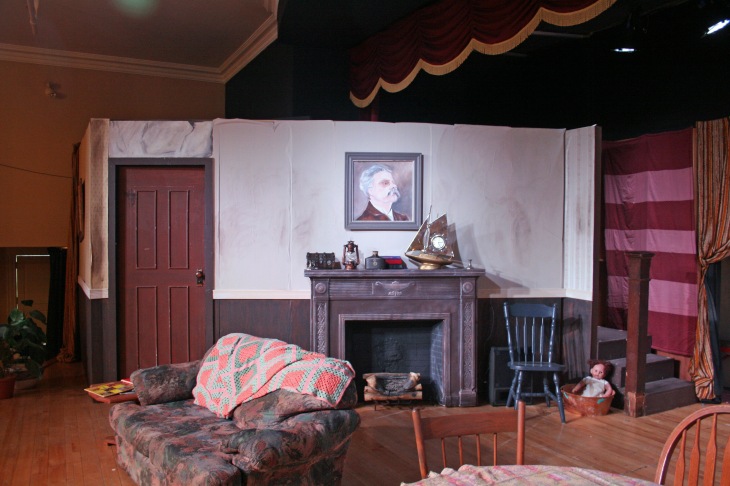
Liberal smears of “dirt”, mismatched furniture, and missing fixtures (like the absence of stair posts and railing) were meant to strengthen the atmosphere. I think this might have been the fifth time I’ve repainted that fireplace. It’s made from plaster laid over a wood and chicken wire frame and suits any kind of set (depending on the colour choice).

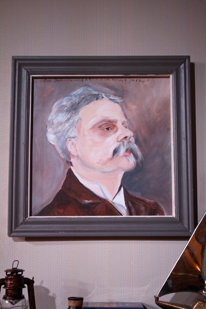
An integral plot point revolved around a fictional John Singer Sargent painting. I did a quick study in acrylic based on an early Sargent portrait of Gabriel Fauré. I felt it would have the right feel when seen from the audience. It’s not an exact copy but props like this only need to look good from far away so there’s no need to be too fiddly with them.

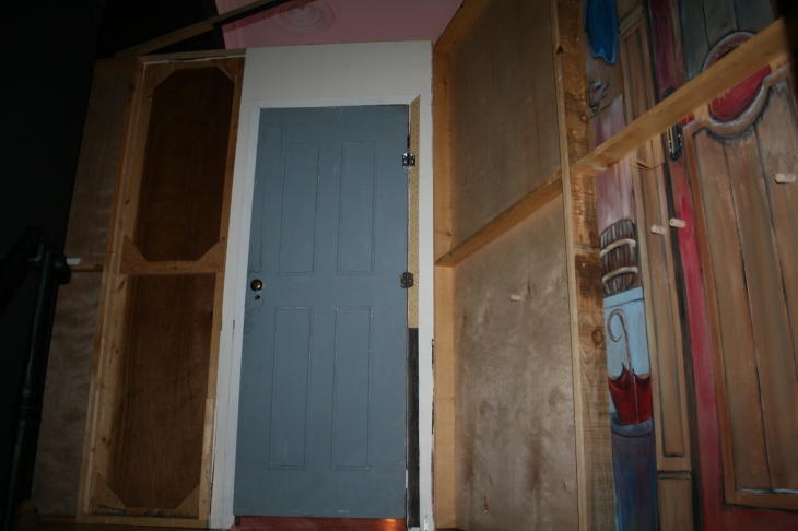
This organization plans to stage Treasure Island in the near future. Some of the scenery from the 2017 production of Peter Pan will be a good fit for the proposed play. These theatre flats are surfaced with thin mahogany sheets. Rather than painting them over, the skins were flipped to preserve the imagery so it’ll be available for future use. This picture shows the section of a flipped skin that was the pirate ship door in Peter Pan. The wine corks cover the end of trim screws protecting actors as they moved behind the set.

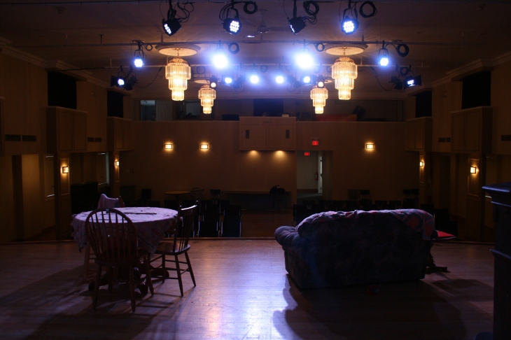
Here is the view from the stage on preview night before the doors opened. This production saw me step out from back of the house onto the stage.  I’ve been in a number of plays but this was the first one for which I had two character roles to play. I also had to learn a new song on the harmonica. The hardest part about that was one of my dogs HATES the harmonica. His brother isn’t too keen either but I feel like one gets the other “going”. It’s impossible to practice when you can’t hear yourself over the howling!

The play was well attended so thank goodness not everyone feels the same way about harmonicas that good old Lester B. does.

The Bridge On Brouwers Line

The bridge on Brouwers Line is located just outside the Archie Coulter Conservation Area. The conservation area stretches for 133 acres along the west branch of Catfish Creek. This piece is based on a photograph I took whilst visiting the site a couple of years ago. The first scan is the work in progress as a pigment pen drawing. The second is the piece finished with water colour.